Call-To-Action Configuration
The goal of this document is to provide a rough idea of the options we currently offer. This document is not exhaustive if there's an option here that you would like more information about please reach out to one of the support options on the home page.
Branding
Since ActivEngage presents our CTAs across a variety of sites covering all makes and website providers. We aim to make our look like they belong. To do this we keep up to date with all OEM guidelines making sure our fonts and style to match their suggested/required look and feel. Currently we offer custom OEM branding for 36 brands.
Here's an example from Toyota: 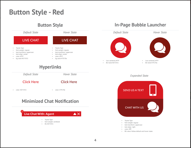
CTA Standard Options
Positioning
When it comes to CTAs where they are positioned is incredibly important. The CTAs should be placed in a way that they will not interfere with the normal interactions with the page but also in a place where the consumer is likely notice.
To that end we've sttled on 8 standard placements for our graphics.
- Top
- Top Right
- Right
- Bottom Right
- Bottom
- Bottom Left
- Left
- Top Left
Visually here's how that looks. 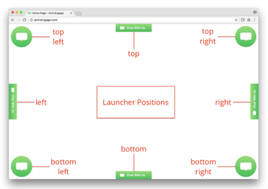
Size
Size wise we support for sizes. These sizes can be specified on a per launcher basis. Meaning you can setup one launcher with the Extra Small size for mobile and then create second launcher with a Large size to display on desktop.
- Extra Small
- Small
- Medium
- Large
Below are the size definitions. 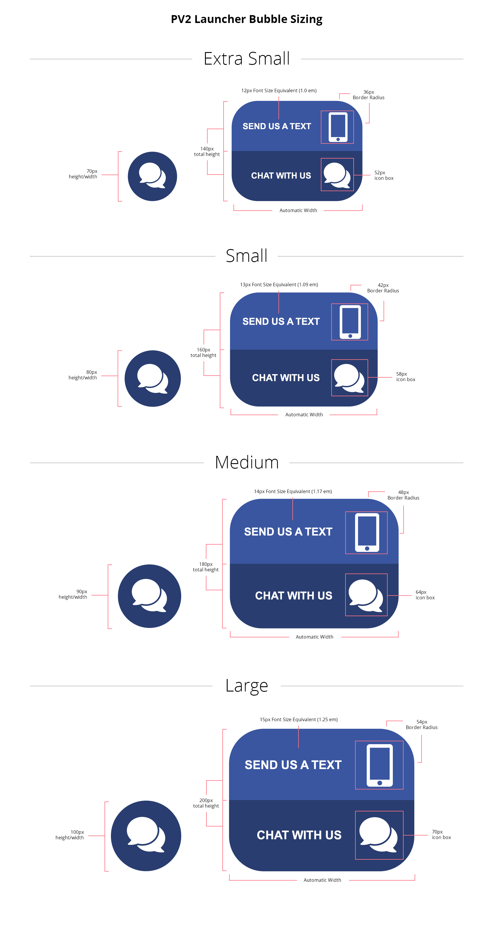
Color
Color is determined by the branding selected for the account. Each brand typically has three color options (though some have asked for more limited options). Of those three options one will be the main brand highlight color and the others will be light or dark variations to ensure that we have contrast options.
Targeting
CTAs can also be spcifically targeted at specified page groups. Some CTAs support text customizations so those can be created specifically for the page they are on. Below are our standard page groups that we recongize.
- Home
- VDP
- VDP Search
- Service
- Parts
- Specials
- Finance
- Retailing
- Other
Style
Lastly our CTAs come in a couple of different styles.
- Launcher - This is a button that floats in the corner or clings to the side of a website.
- Invite - This is typically a CTA that moves and provides a place for custom text.
- ActivTarget - This is a form CTA that provides an area for the customer to enter their information and recieve a coupon for example.
- In Line - These are CTAs typically controlled by the WSP that are in line with existing content.
Launcher
The launcher itself comes in several different styles. They are:
- Bubble
- Bubble with Invite
- Button
- Rectangular Bubble
Here's an example of what those look like. 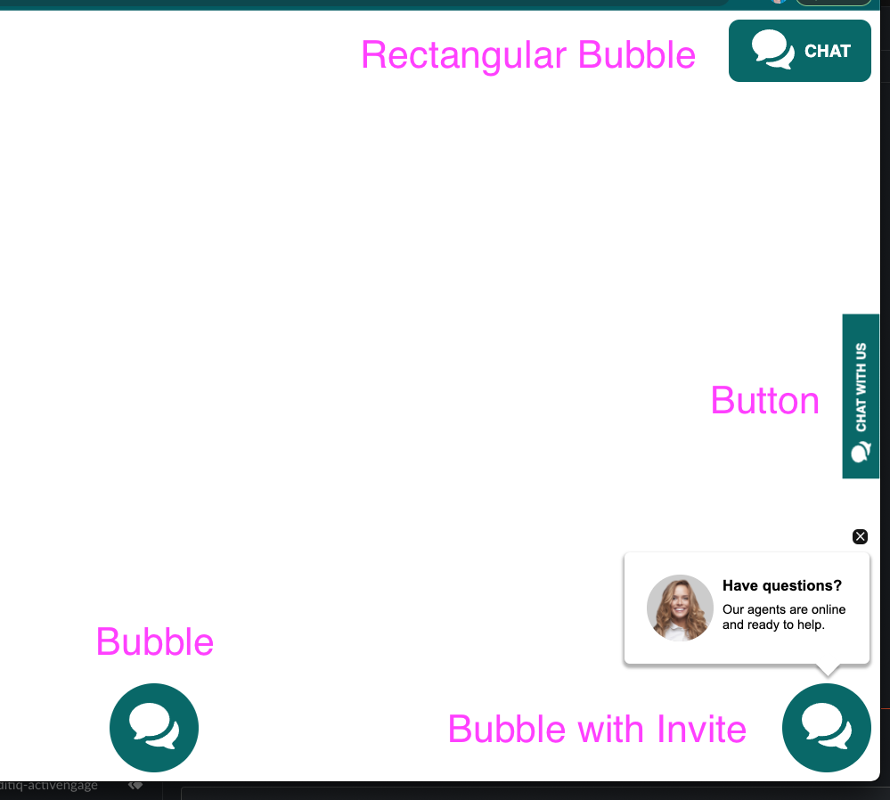
Invite
Our invite CTA has several different combination options. There are four areas that you can choose to customize.
- Model
- Text
- Path (ie where the invite shows)
- Cadence (ie when the invite shows)

ActivTarget
ActivTarget is a product unto itself. Please submit questions to support for more information. 
In Line Call-to-Action
In line call to actions typically require that the WSP provides an API that allows us to embed the CTA directly in the content on the page. This button also takes on the styling already provided by the WSP making it appear as if it belongs.